A common question from clients is, "Will our future be okay?"
- Create additional proposals and model what-if scenarios using the Action Items
- Use the Probability and Confidence tabs to analyze your client's Probability of Success
- Directly compare two different plans using various charts in the Comparisons tab
- Use the Savings and Retirement Details tabs to glean valuable insights on your proposals
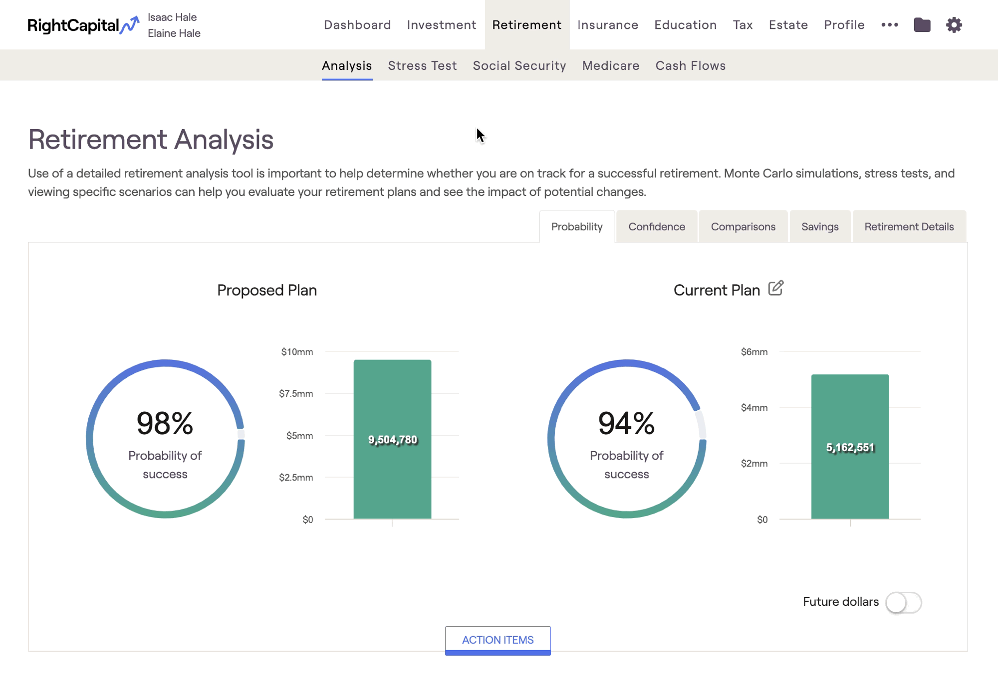
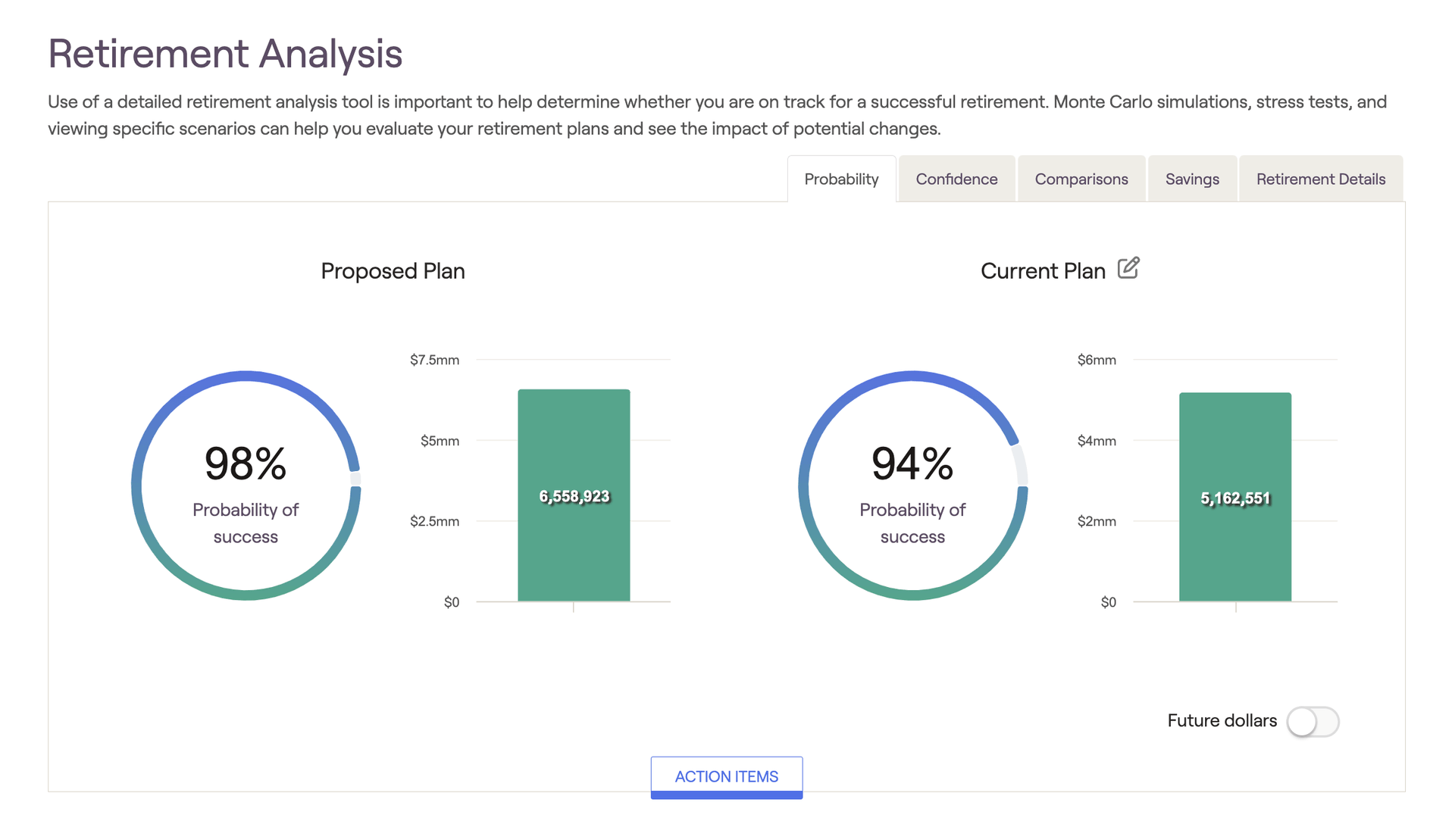
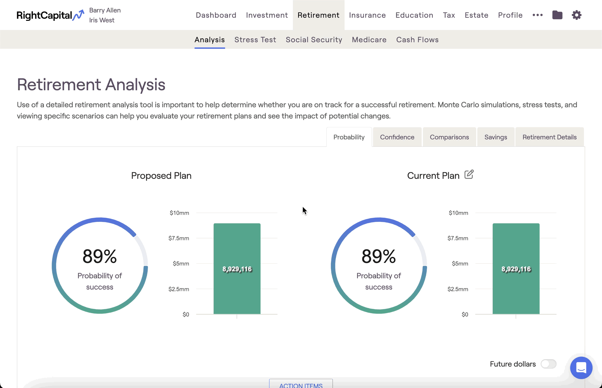
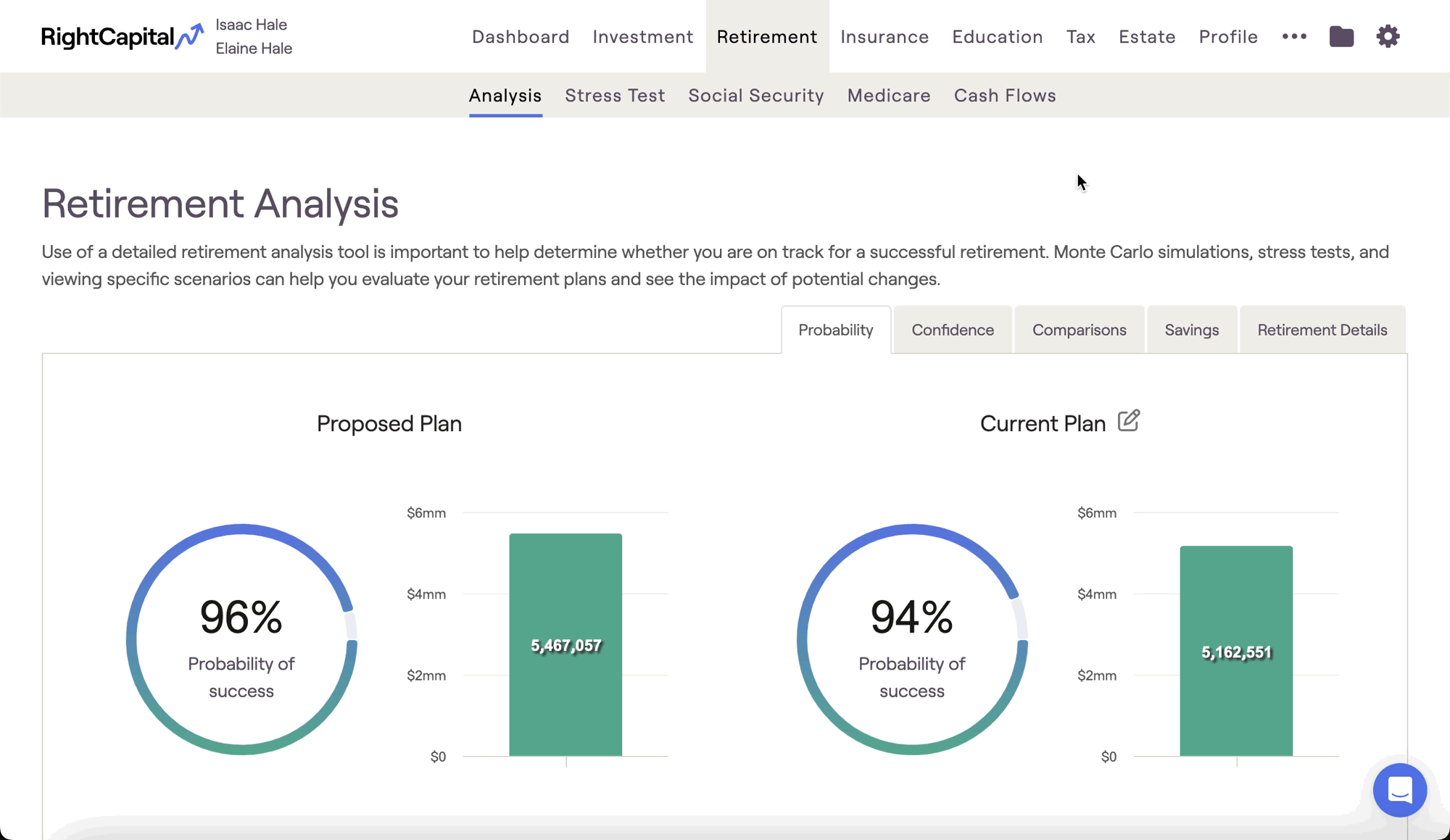
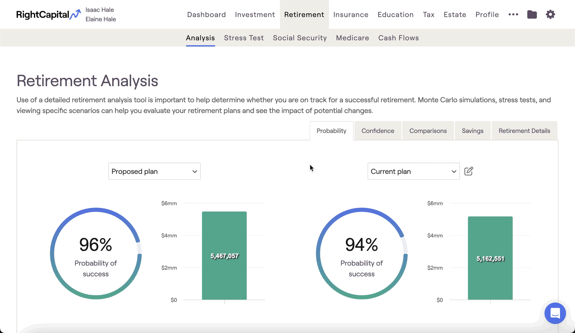
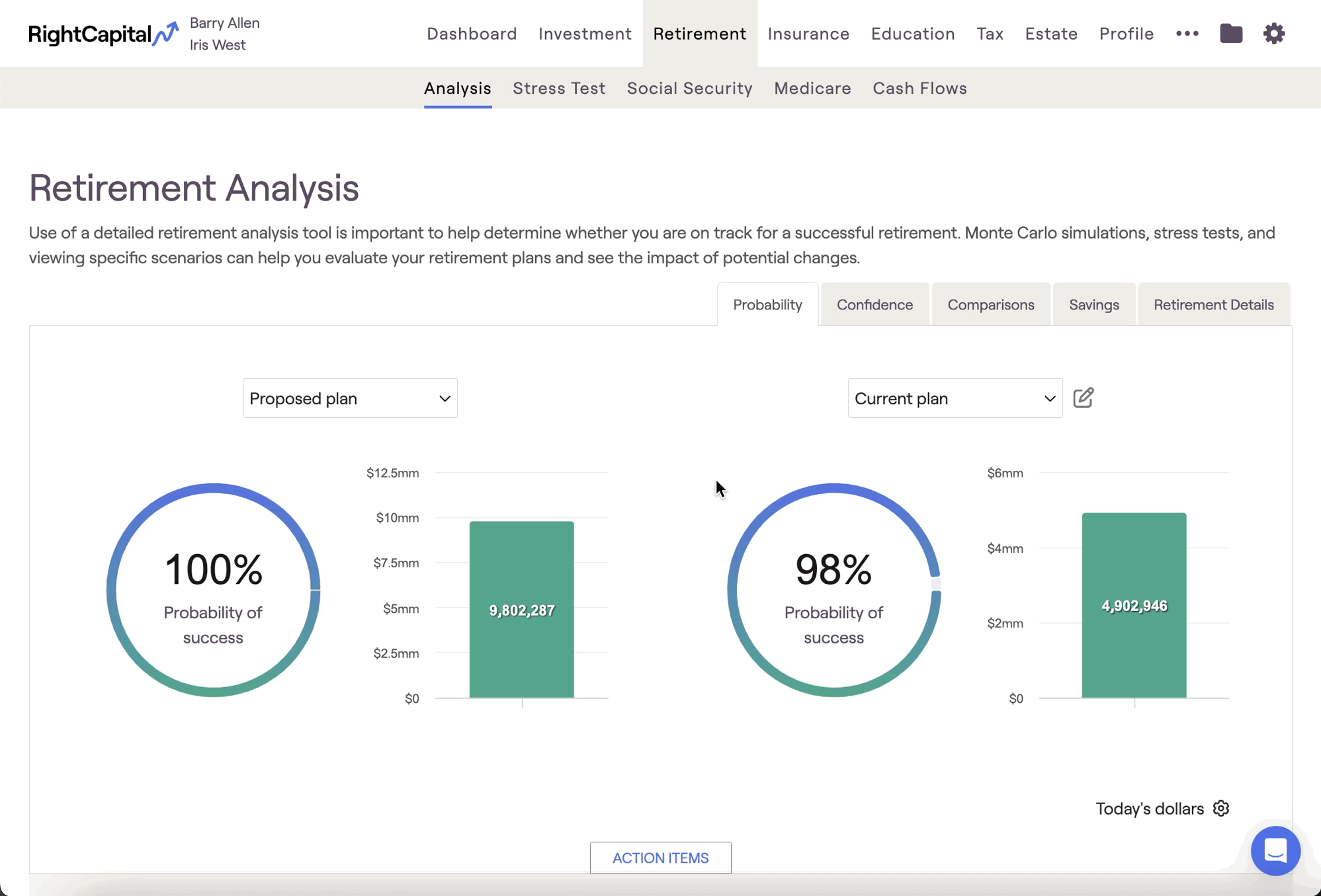
Probability Tab
Action Items
Please see the article below for a comprehensive overview of the Action Item functionality, including proposing changes, implementing strategies, and adding new items:
Create Additional Proposals
Please see the article below for a comprehensive overview of creating and working with multiple proposed plans:
Probability of Success
The probability of success is based on a Monte Carlo simulation that runs a client's plan through 1,000 trials. The simulation factors varying levels of market volatility into each and every trial to create a comprehensive range of potential outcomes. The probability of success demonstrates the percentage of those trials that are successful, i.e. the trials that do not run out of money at any point during the client's plan.
Even if the simulation registers assets remaining in the last year of their plan, the overall probability of success will decrease if there are any years in which the simulation reports $0 within their projection. This can be best visualized by using the Confidence chart in the tab to the right of Probability (more on this below).
While it is difficult to pinpoint a universal percentage that qualifies as a "good" probability of success, 80% is often cited as a standard benchmark for a reasonable PoS%. That being said, there are various schools of thought when it comes to interpreting Monte Carlo, and in many cases the "target" probability of success is highly dependent on a client's age and willingness to make adjustments in the case of poor markets or unforeseen circumstances. Please feel free to use and interpret RightCapital's Monte Carlo analysis in accordance with your own perspective and advising philosophy.
Median Ending Invested Assets
The value in the green bar chart next to each PoS% reflects the ending invested asset value for the median Monte Carlo trial. While the median (also referred to as trial 500) only represents one possible outcome of many, this trial represents the "middle outcome" and is therefore a useful frame of reference. The median trial is visualized as a solid blue line within the Confidence chart:
Display Settings
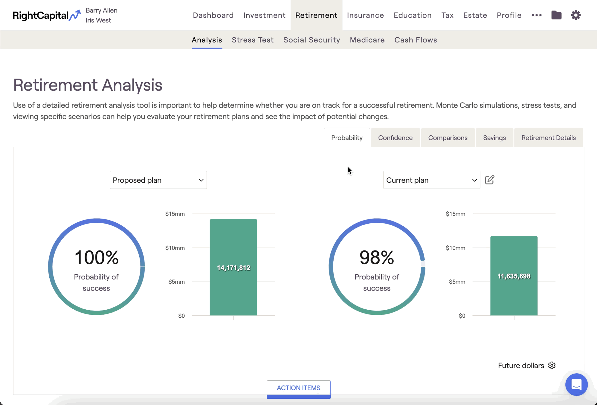
With today's dollars selected, RightCapital will discount the values calculated by your general inflation rate, which can help put things into perspective for you and your clients (especially for younger clients with long plan durations).
You can also use the display settings to use the same scale (y-axis) for both charts on the Probability tab, and/or show swap client age with calendar year on the x-axis of other Retirement Analysis charts:
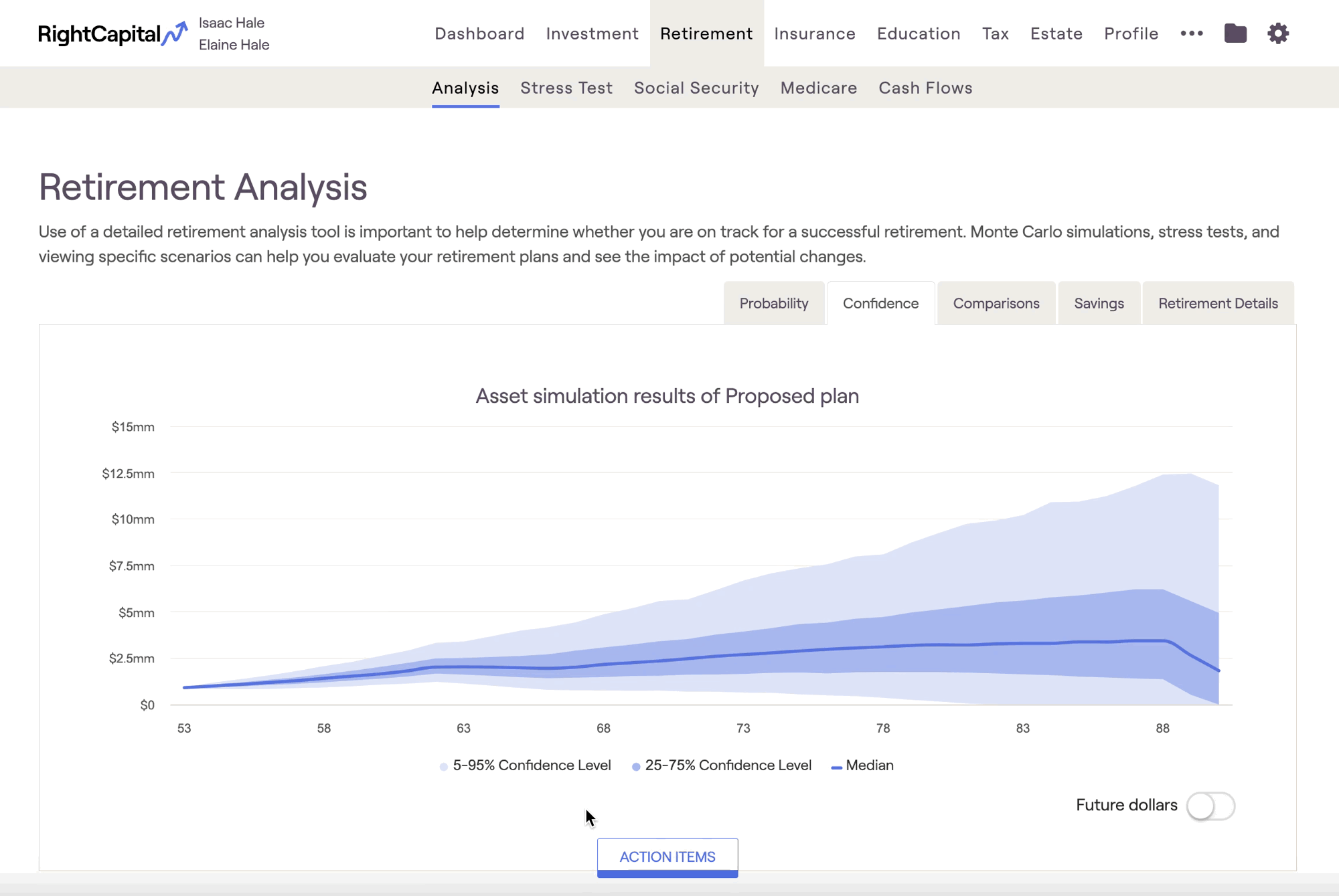
Confidence Tab
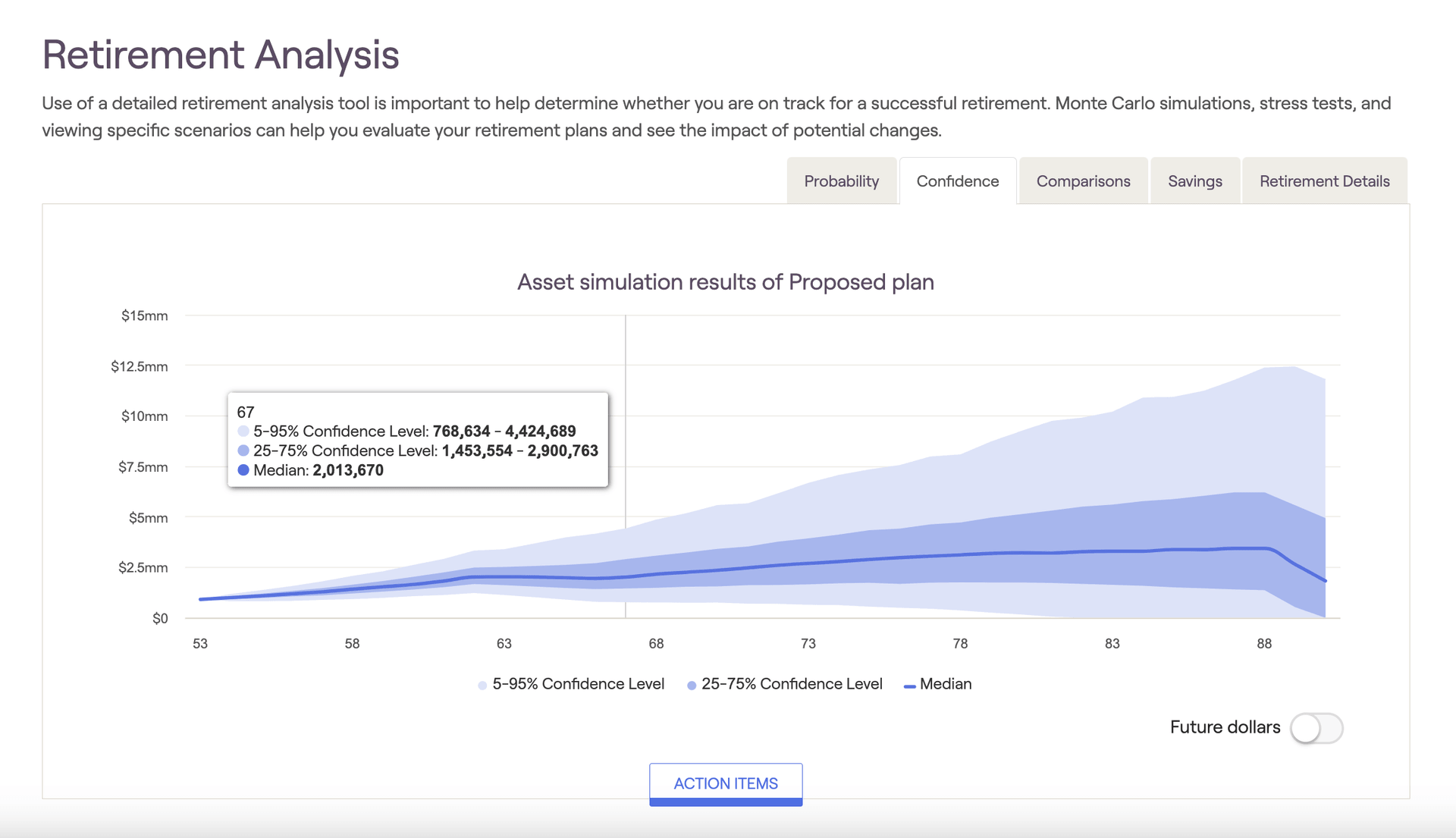
At each age (reflected on the x-axis), the 1,000 Monte Carlo trials are ordered by asset value. For the 5-95% Confidence Level, only the highest and lowest 5% of the values are excluded. So, the results of trials 51 - 950 (in asset value order) are reflected within the light blue shaded area in the confidence chart. This means that 90% of the time, a client's assets will fall somewhere between the upper and lower boundary of the light blue area. The 25-75% confidence range reflects trials 251 - 750, and the Median reflects "trial 500".
Many clients often latch onto the median value as their expected retirement value at any given point. However, at best, this only has a 1/1,000 chance of being exactly true! Some successful advisors carefully disclose both the reality of a simulation ("we can't know the future until we're there") and the reality of probable range over exact value.
Using the legend underneath the chart, you can toggle the displayed values and zero in on a specific confidence interval. As a reminder, the dollar value for the median trial in the final year of the plan is the Median Ending Invested Asset value- this will align with the value displayed within the green bar graph in the Probability tab.
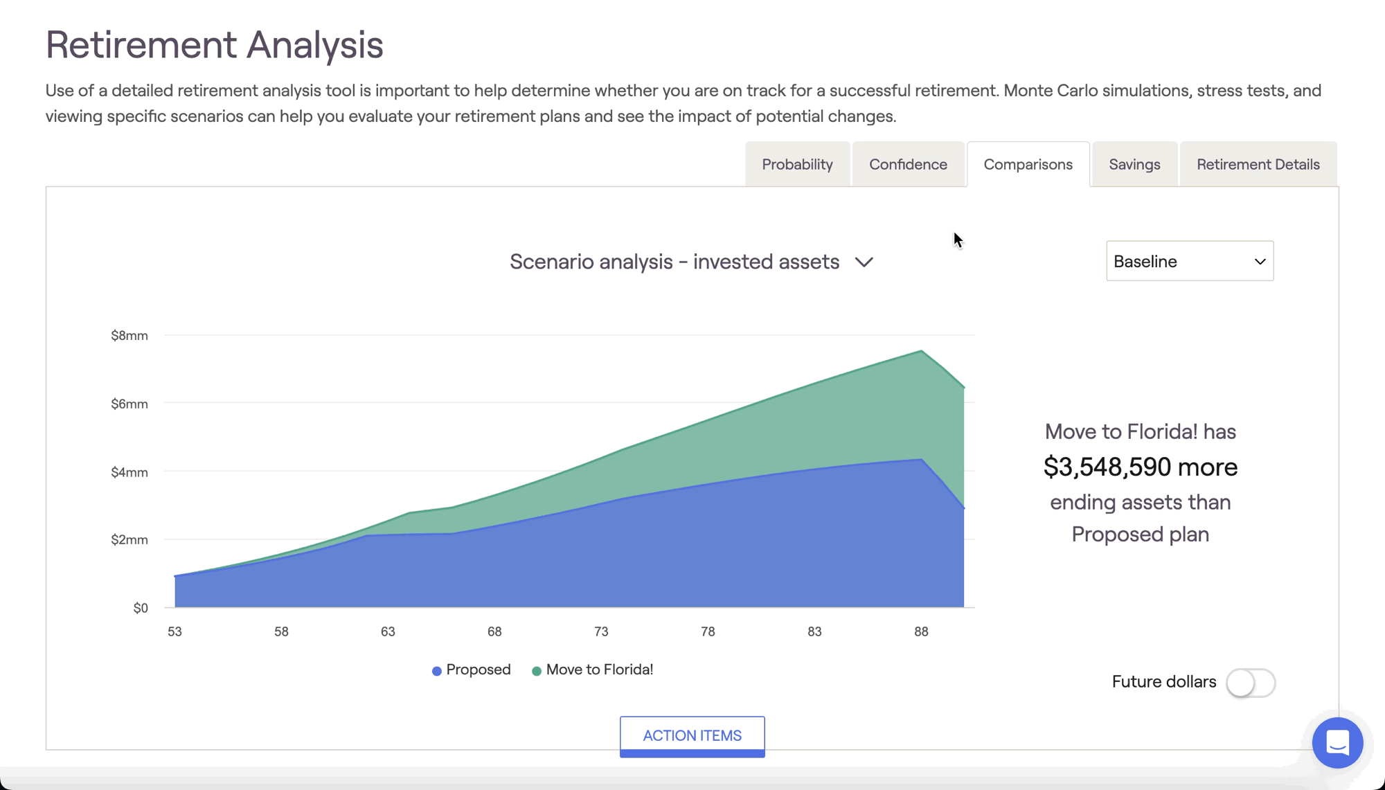
Comparisons Tab
The Comparisons tab allows you to directly compare two plans against each other, highlighting the differences in invested assets, taxes and more. The two plans displayed here are determined by the plans you've selected on the left and right sides of the Probability tab.
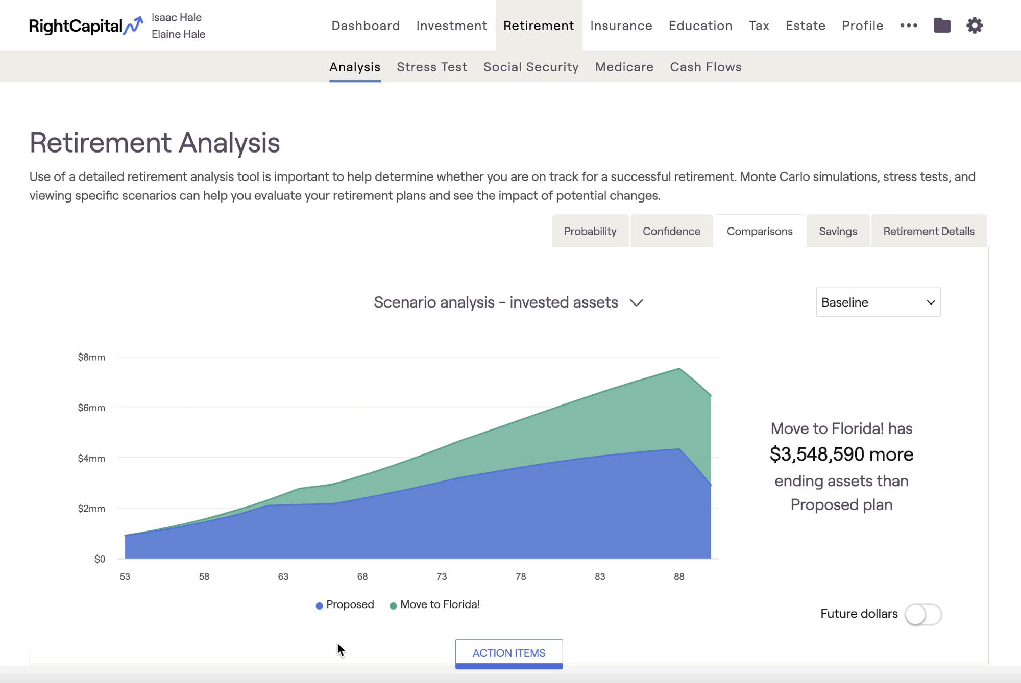
Scenario Analysis Charts
There are four different scenario analysis charts within the Comparisons tab: Invested Assets, Net Worth, Taxes, and Assets at Retirement. Hovering your mouse over each chart allows you to see dollar values for each year:
- Invested assets (initial view): Compares the value of invested assets over time (excludes real estate and other assets)
- Net Worth: Compares the client's total net worth over time (all assets and liabilities)
- Taxes: Compares the client's estimated tax burden throughout the plan
- Assets at Retirement: Compares the client's invested assets at the beginning of their retirement
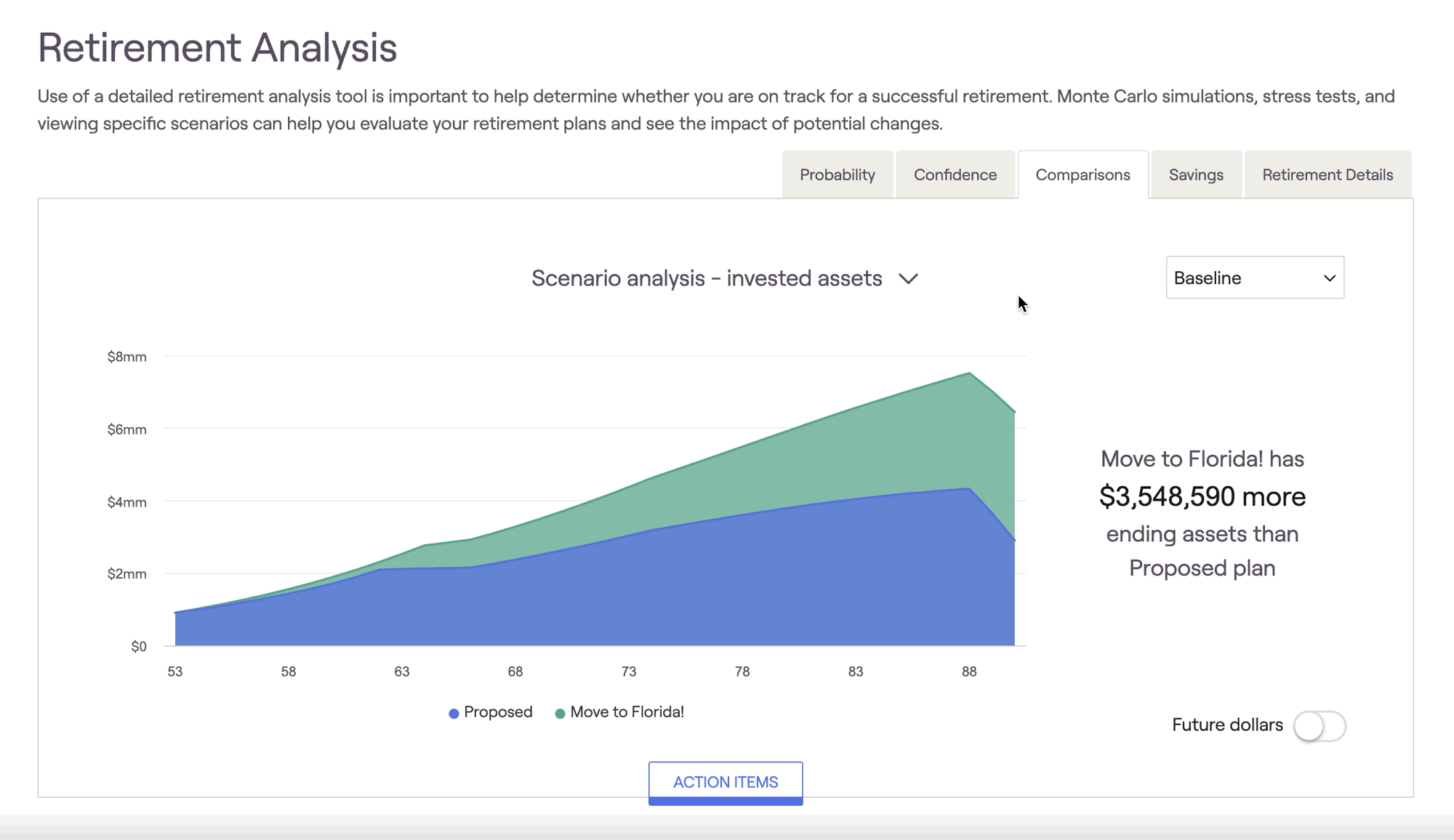
Some successful advisors use the Comparisons tab to demonstrate the value of shifting assets from one allocation style to another. This can be a powerful tool to elevate your expertise to your clients in a visual format. Build an excellent proposal based on your client's unique needs and goals and compare it to how they are currently holding their assets -- your value will be clear as day, and your clients will stick with you over the long haul!
Return Scenarios
To inject some volatility into the Comparisons tab, you can implement custom return scenarios to recalculate the values shown using a different sequence of returns. Use the dropdown box on the right to toggle between return scenarios:
There are four pre-built return scenarios:
Bad decade followed by slow growth
Fed adverse scenario followed by modest growth
Strong growth scenario
Flat 0% return
Savings Tab
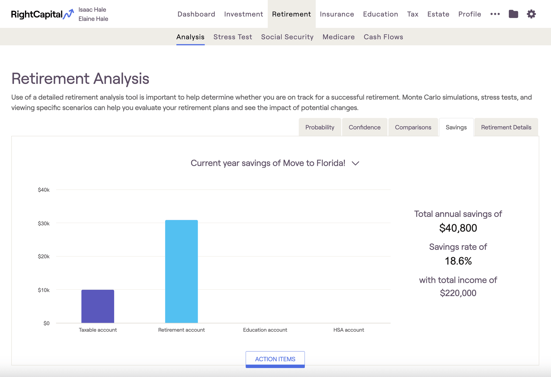
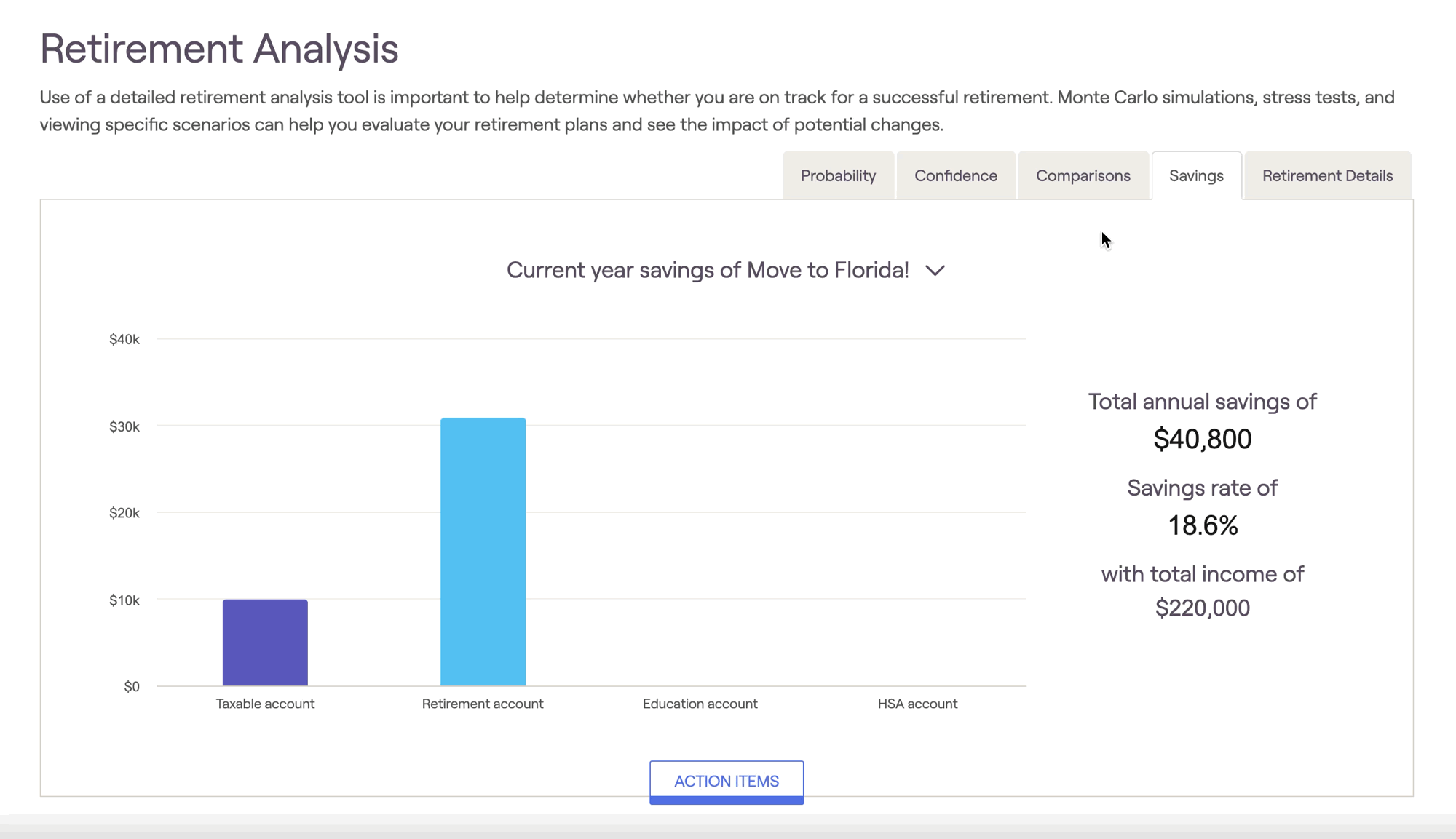
If either the client or co-client is already retired, only the Current Year Savings chart will be available.
Current year savings
This chart highlights investment contributions occurring in year one of the cash flow projections:
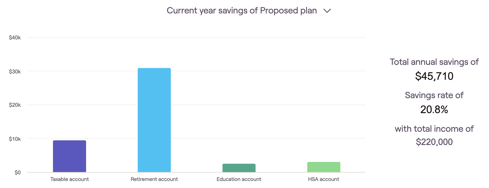
The first year of each client plan can be customized using the "Cash Flow in simulation starts" methodology setting. The current year's savings are grouped into four buckets, which are color-coded for visual clarity:
Taxable account savings
Retirement account savings (including 401(k)s, IRAs, Roth IRAs, etc.)
Education account (529) savings
HSA account savings
This tab will also display the total annual savings and the percentage of total income saved to the right of the graph.
Savings over time
This chart illustrates the annual investment contributions that occur until the first client retires:
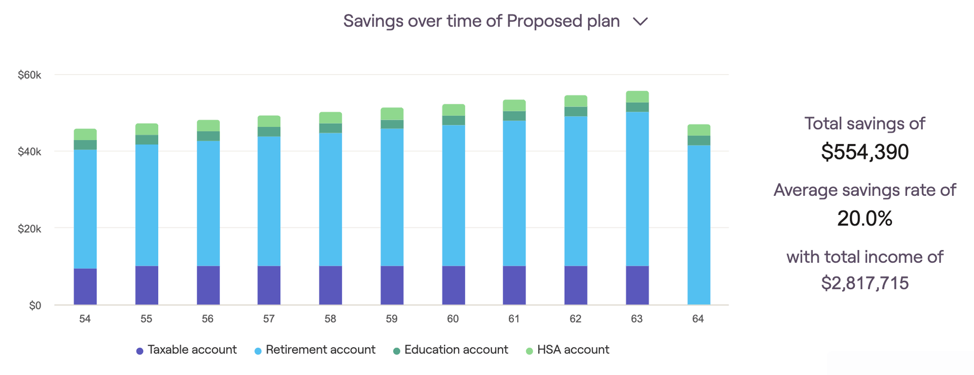
Savings are grouped into the same four buckets described above, and are color-coded identically. The "total savings" and "average savings rate" will be listed on the right side of the graph.
As a reminder, you can use the "today's dollars" toggle in the lower right to discount the values displayed by your general inflation rate.
Savings rate
This chart recalculates annual savings as a percentage of the client's income:
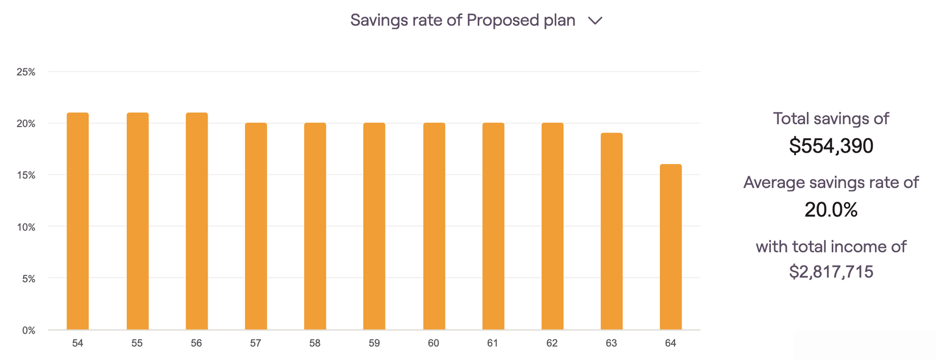
The savings rate percentage for each year is equivalent to total savings divided by total income. You can hover your mouse over the bar chart to isolate the exact savings % for a particular year. The "average savings rate" will also be listed to the right of the graph.
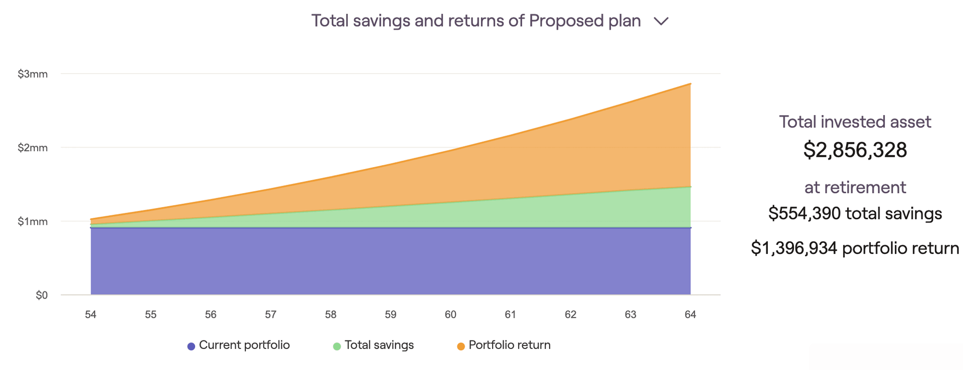
Total savings and returns
This graph highlights the individual impact of investment contributions and portfolio return as a client's assets accumulate. It displays the current portfolio value, cumulative portfolio return, and total employer/employee savings each year until the first client retires:
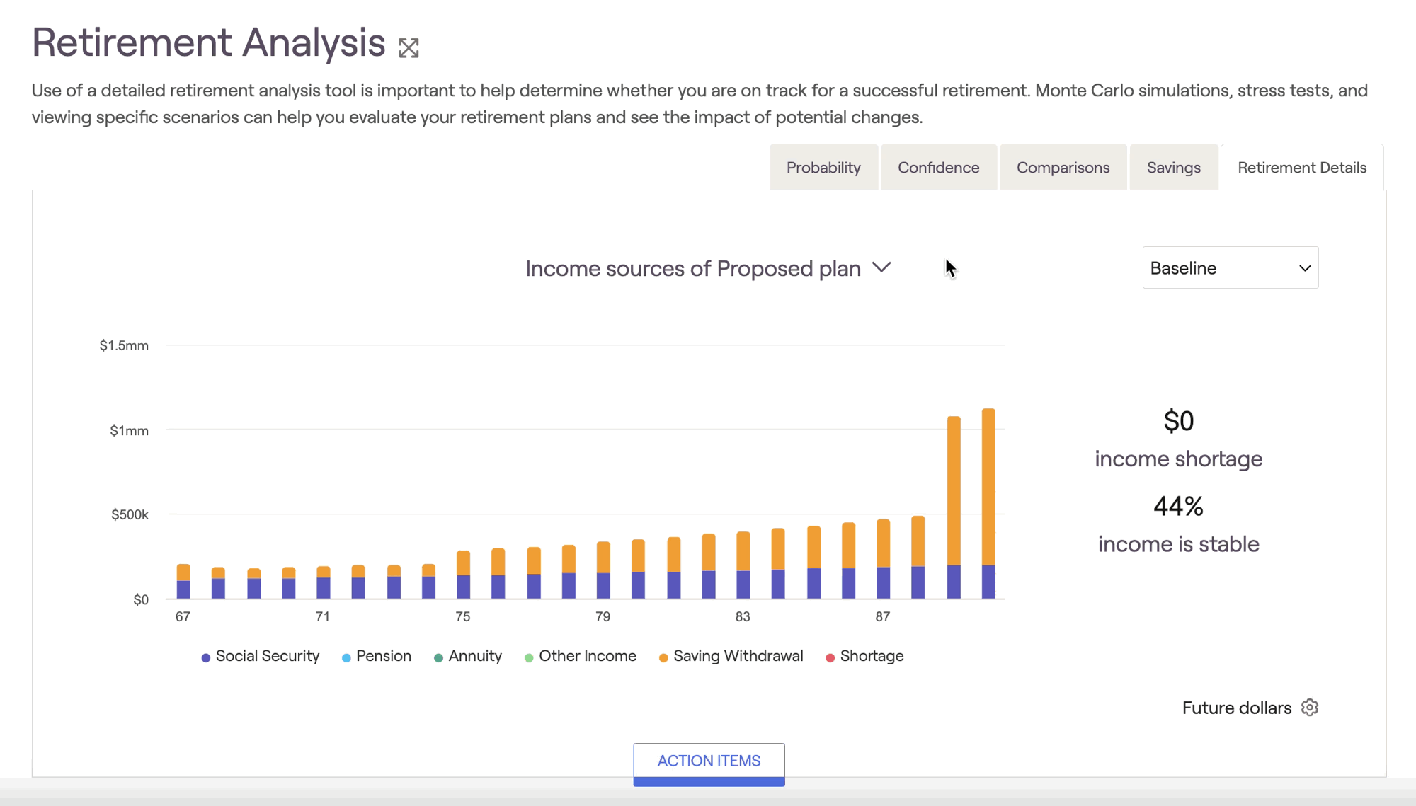
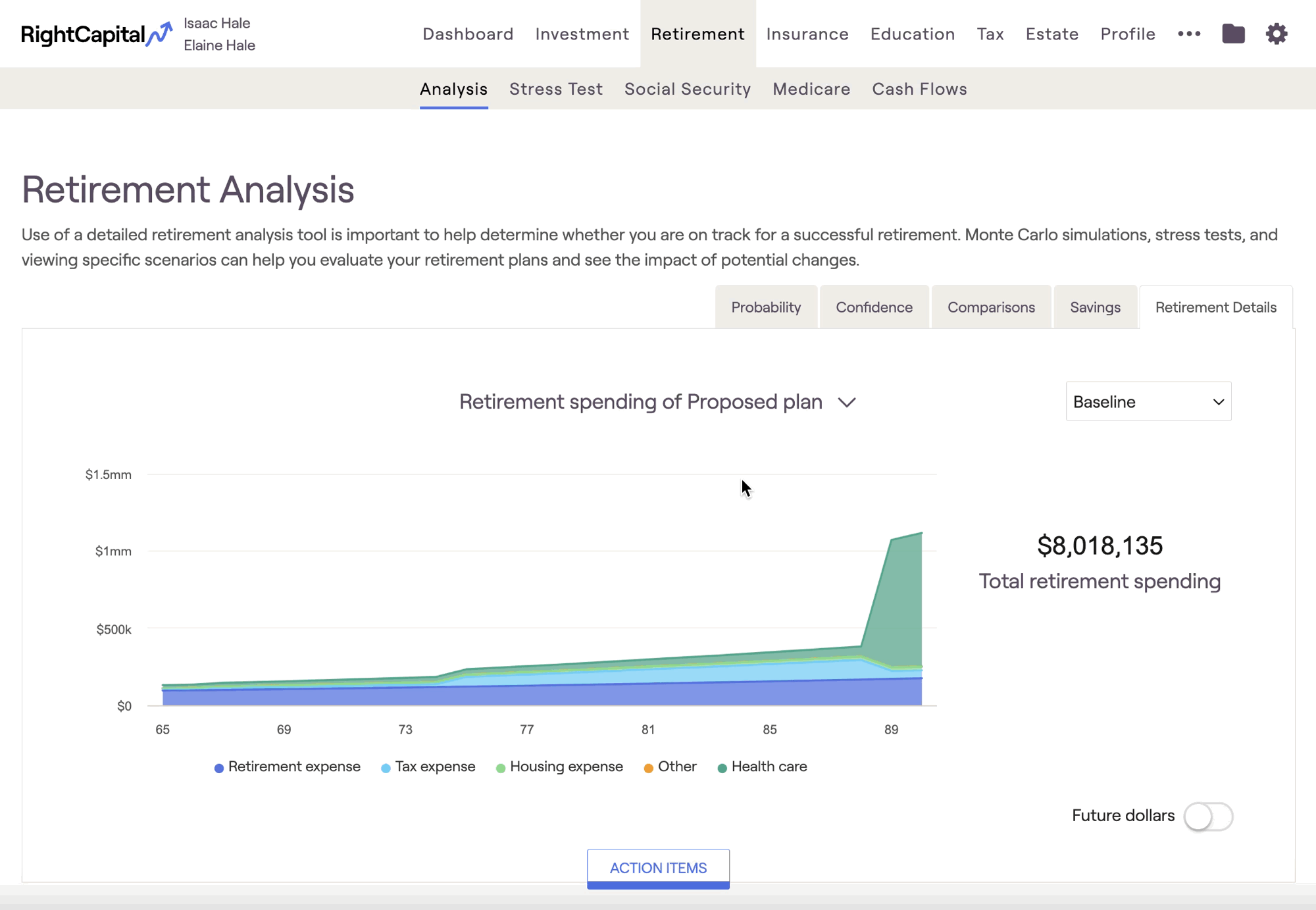
Retirement Details Tab
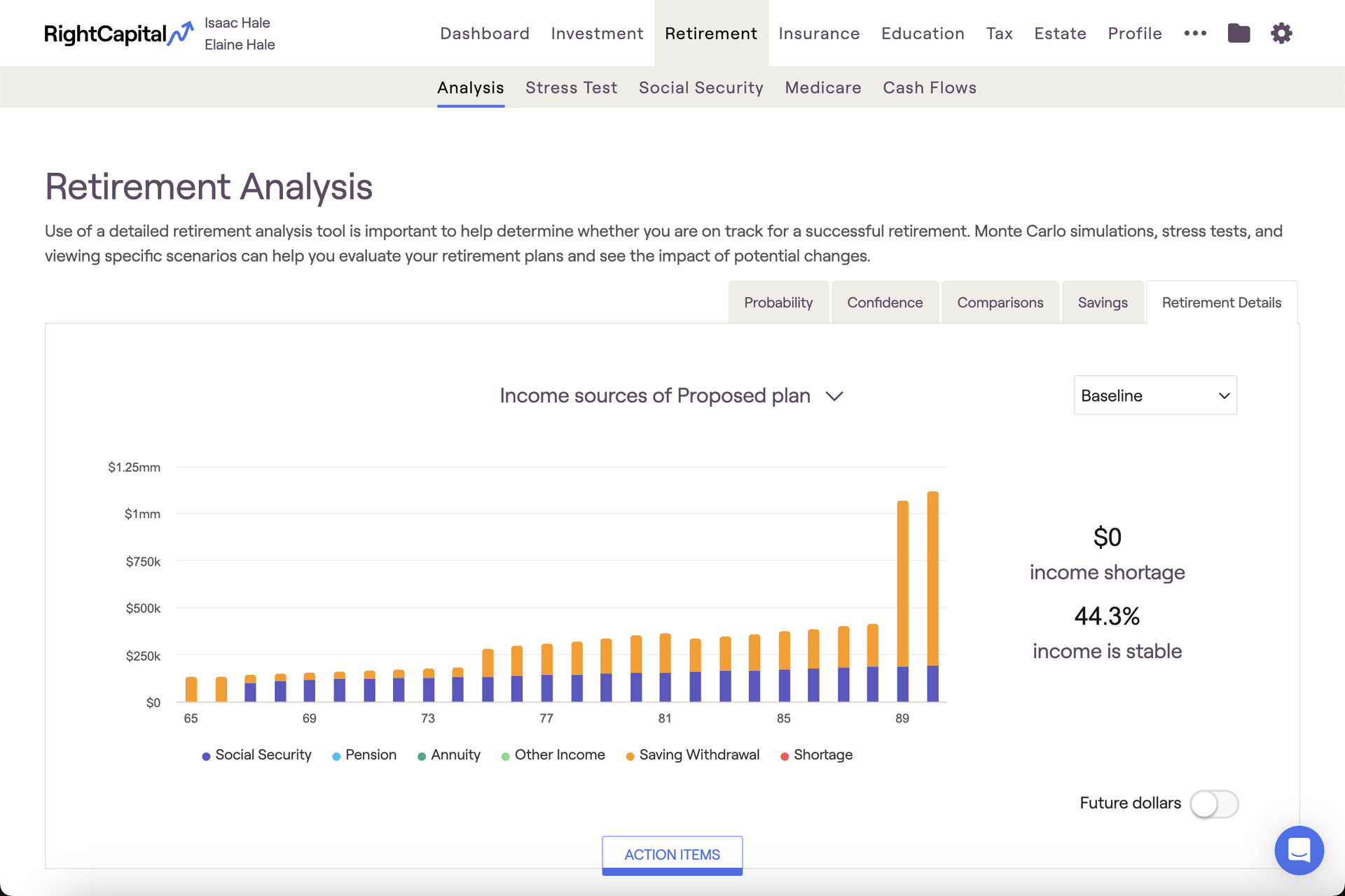
This tab offers several graphs that provide visual backdrops for crucial talking points: Income sources, Withdrawal rate, Retirement spending, and more. Hovering your mouse over each chart allows you to see dollar values for each year:
Just like the Comparisons tab, Retirement Details allows you to toggle between different return scenarios using the dropdown menu in the upper right.
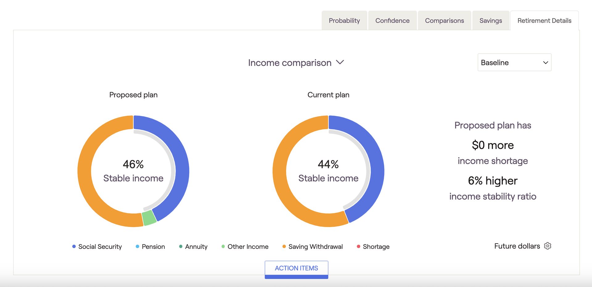
Income Sources
The Income Sources chart provides a breakdown of the client's retirement income sources. Each income source is color-coded to provide a clear, visual distinction between each:
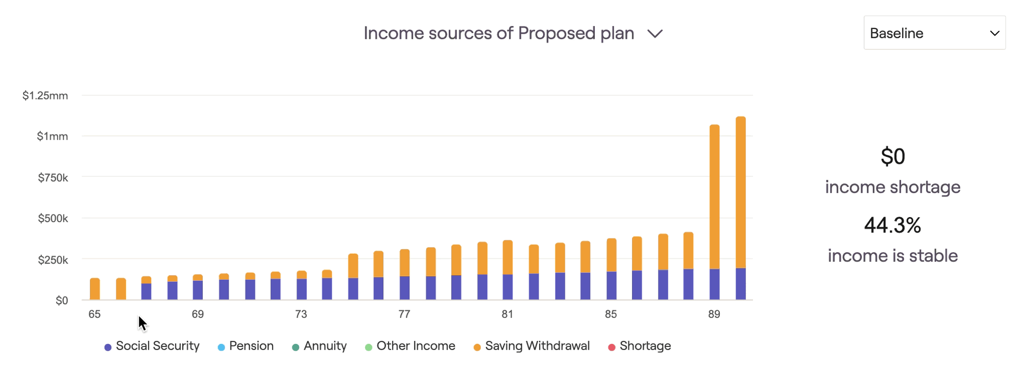
Social Security, Pension Income, Annuity Income, and Savings Withdrawals are always shown, even when not required to cover a client's yearly outflows. Other income represents the combined amount of all other income sources, and will only display in this chart if needed to cover additional outflows.
Withdrawal Rate
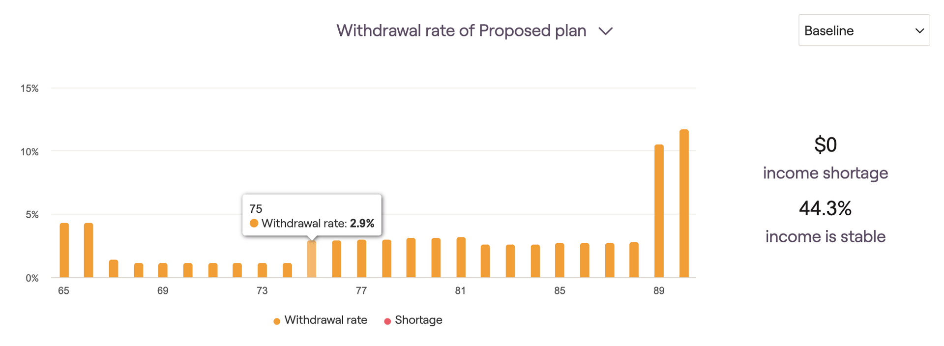
The Withdrawal rate chart illustrates the percentage of invested assets withdrawn each year to fund retirement expenses. This number will include any RMDs, manual distributions, and negative net flows that occur due to cash flow deficits. Hover your mouse over the bar chart to see the withdrawal rate percentages for each year.
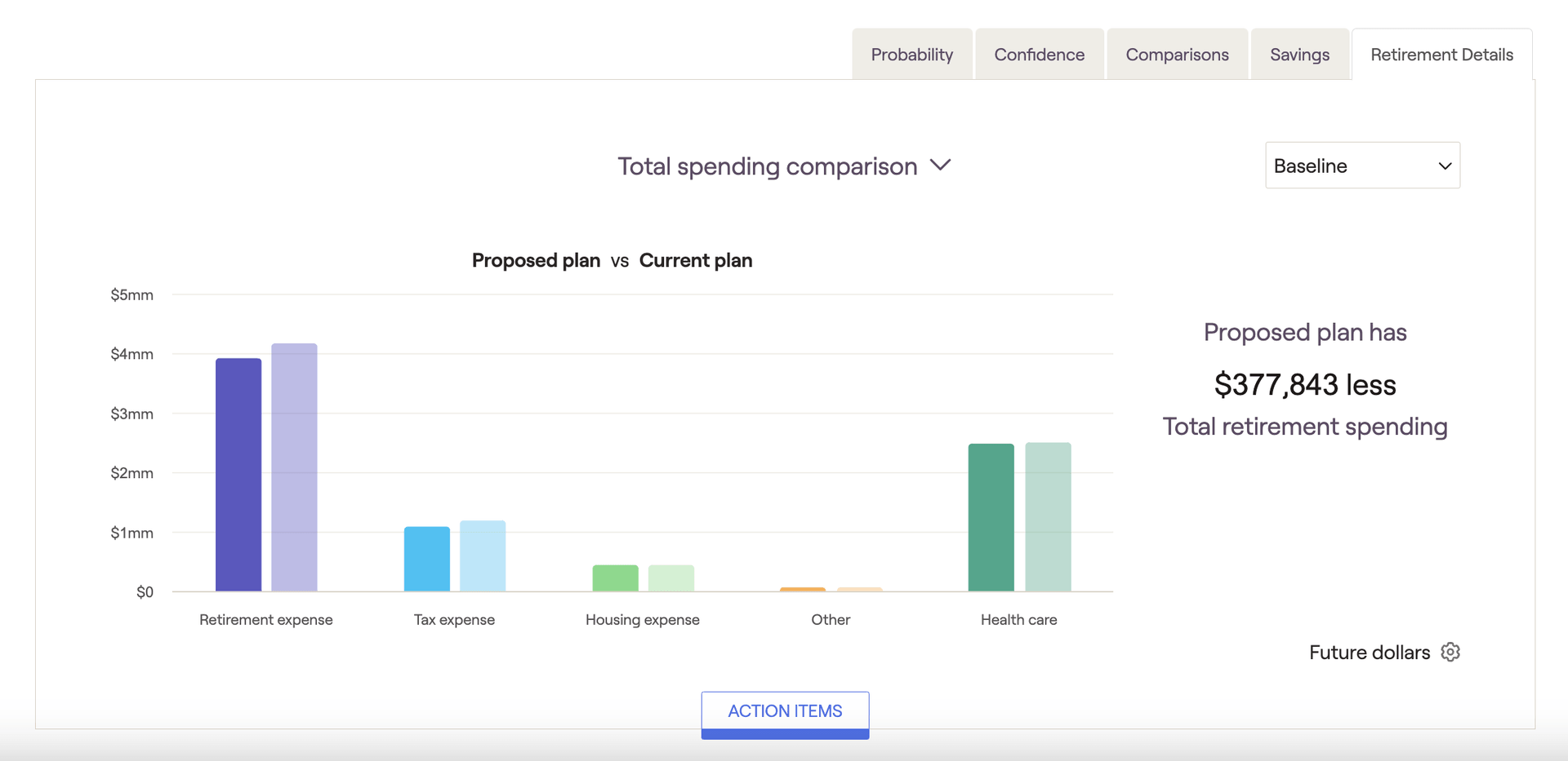
Retirement Spending
The Retirement Spending chart provides a breakdown of the client's retirement expenses. Each expense category is color-coded to provide a clear, visual distinction between each:
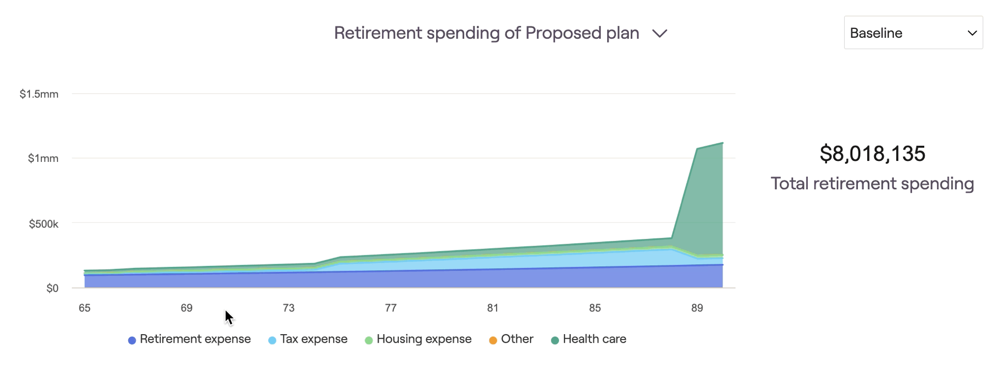
This chart excels at visualizing the impact of retirement spending strategies on a client's retirement expenses. Implement a spending strategy using the Action Items, and then isolate the "retirement expense" category using the legend underneath the chart:
Income Comparison
Total Spending Comparison
Floor and Ceiling Strategy
If your currently selected proposal is utilizing the 'Floor and Ceiling' retirement spending strategy, you'll find an additional chart called Floor and Ceiling Spending Strategy:

This chart helps to visualize a client's annual retirement expenses in relation to the floor and ceiling values. As a reminder, you can update the parameters for the Floor and Ceiling strategy in the Advisor Portal > Models > Retirement Spending tab.
Guardrails Strategy
If your currently selected proposal is utilizing the 'Guardrails' retirement spending strategy, you'll find an additional chart called Guardrails Spending Strategy:
This chart displays a client's withdrawal rates in retirement, side-by-side with their retirement living expenses. This comparison makes it clear how a client's expenses are impacted when their withdrawal rate exceeds or dips below the upper and lower guardrails. As a reminder, you can update the parameters for the Guardrails strategy in the Advisor Portal > Models > Retirement Spending tab.
For a deeper dive into the Retirement Analysis module and all of its charts and features, feel free to watch our webinar on Maximizing the Retirement Analysis.


