
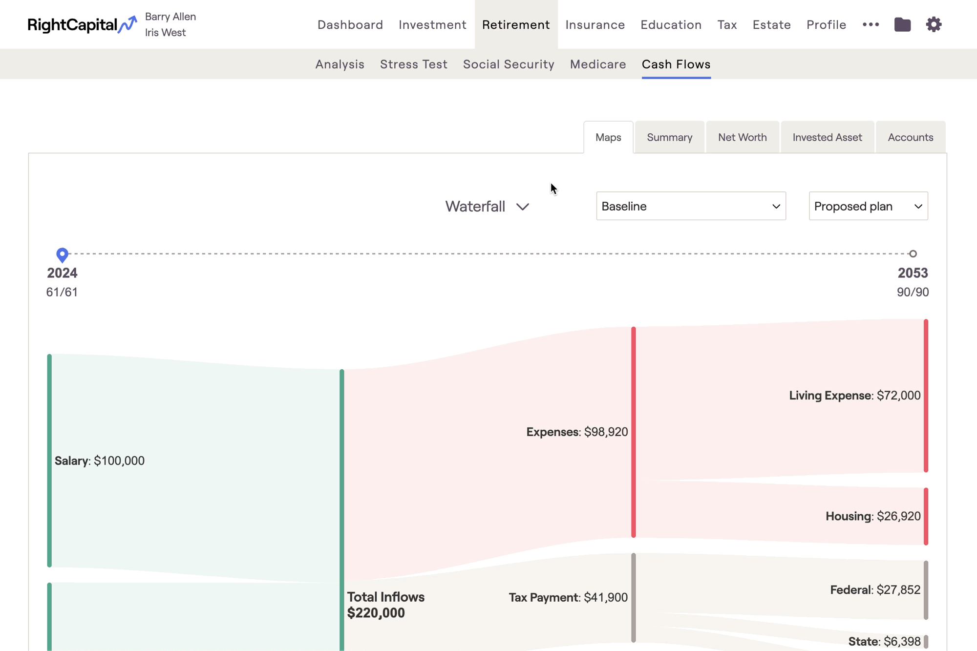
Click on the inflow and outflow sections of the Waterfall chart to see a breakdown of the underlying values.
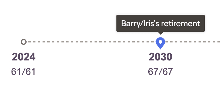
Above the chart you will find a timeline; drag the pin icon along the timeline to select a specific year of the Cash Flows. A tooltip will appear to help you easily identify the year that each client retires:
Waterfall
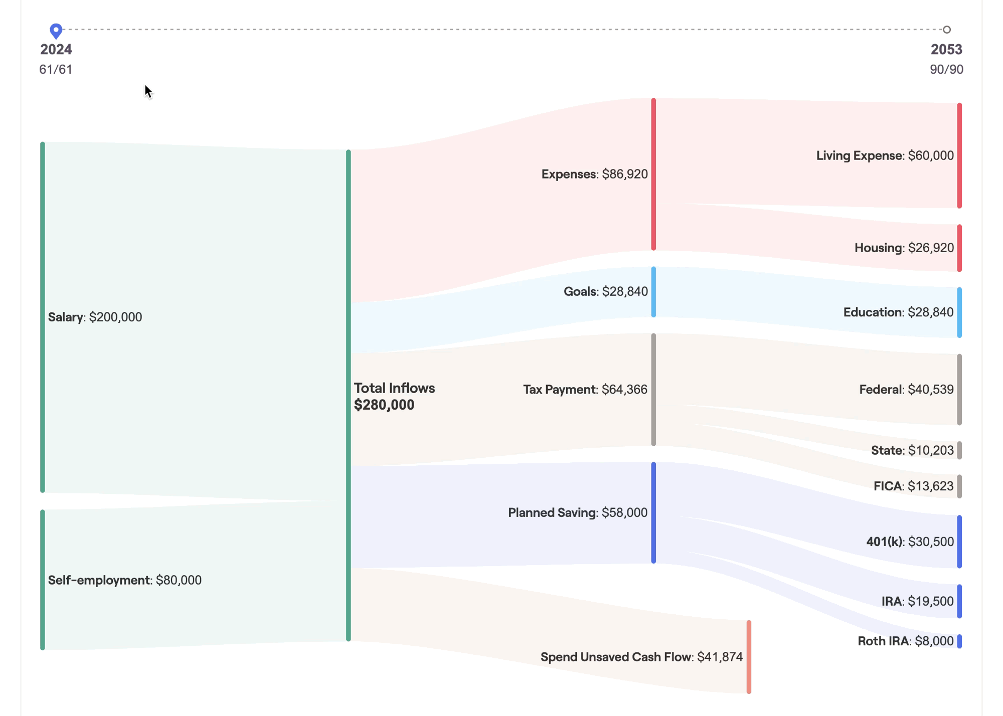
As you scroll through the timeline, you can start to paint a picture for clients, detailing how their income, savings, goals, and expenses might change over the course of their financial lives. This can be a powerful visual backdrop for your planning conversations, and an invaluable tool for client meetings and presentations.
The values displayed here are identical to those found in the Summary tab. For clients who may have difficulty reading and understanding a more traditional cash flow table, Maps can be a useful visual aid in demonstrating where their money is coming from, and where it is going each year.
Breakdown
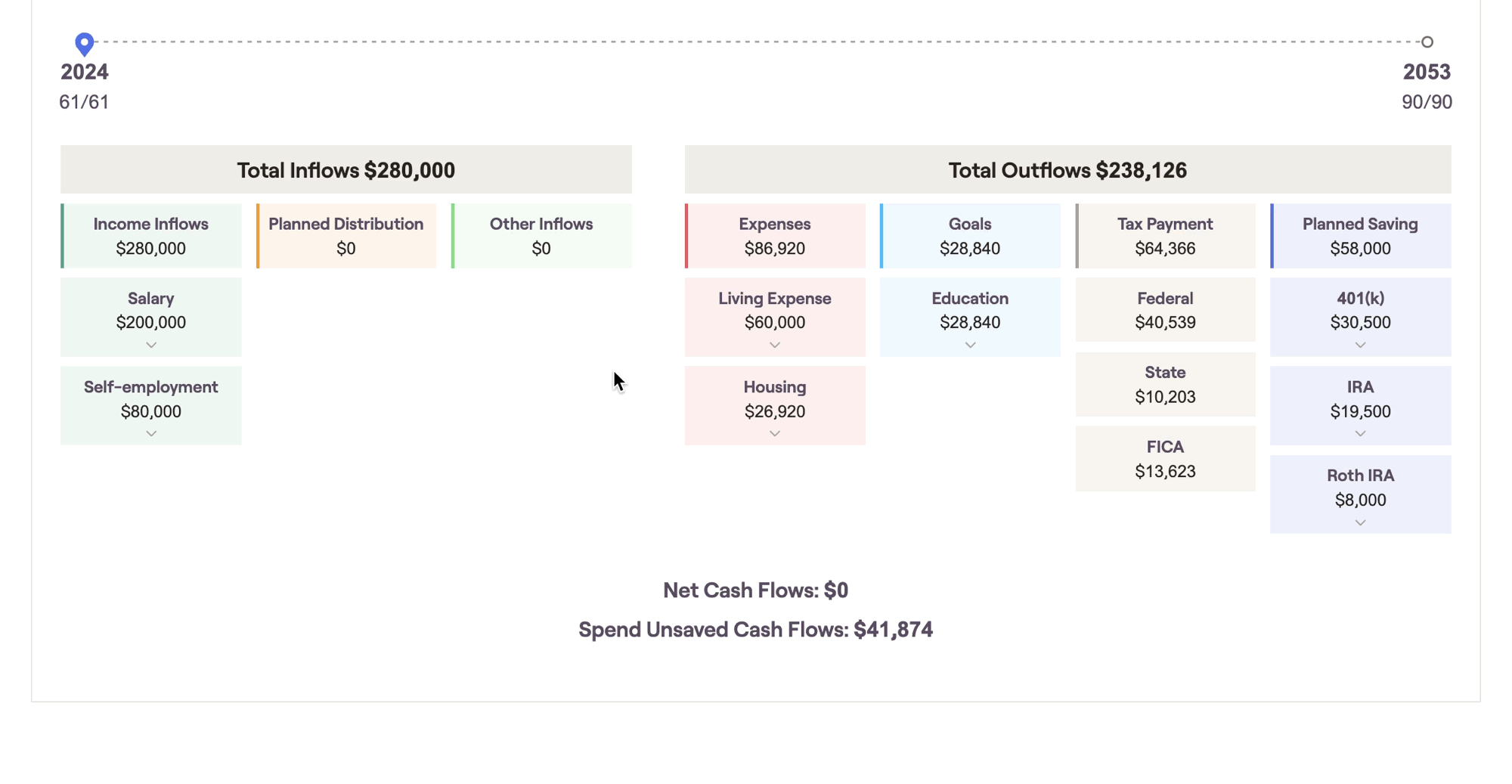
This chart combines visual simplicity with dynamic granularity, allowing you to click into individual tiles to "zoom in" for more detailed cash flow information. Just like the waterfall, this chart focuses in on one cash flow year at a time using the navigational timeline above the chart.


