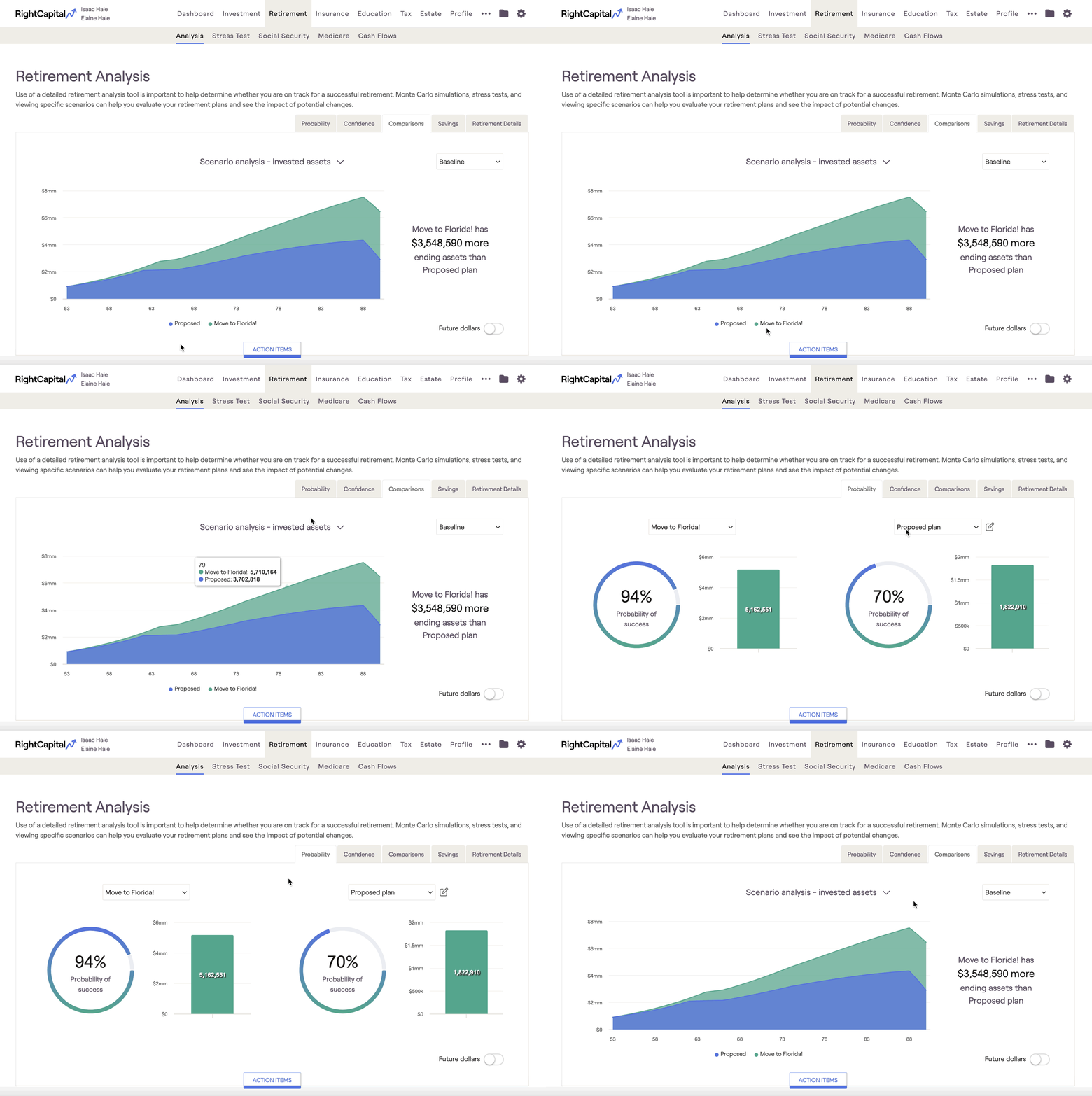
Scenario Analysis Charts
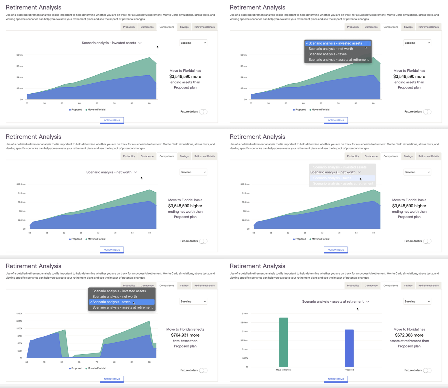
There are four different scenario analysis charts within the Comparisons tab: Invested Assets, Net Worth, Taxes, and Assets at Retirement. Hovering your mouse over each chart allows you to see dollar values for each year:
- Invested assets (initial view): Compares the value of invested assets over time (excludes real estate and other assets)
- Net Worth: Compares the client's total net worth over time (all assets and liabilities)
- Taxes: Compares the client's estimated tax burden throughout the plan
- Assets at Retirement: Compares the client's invested assets at the beginning of their retirement

Some successful advisors use the Comparisons tab to demonstrate the value of shifting assets from one allocation style to another. This can be a powerful tool to elevate your expertise to your clients in a visual format. Build an excellent proposal based on your client's unique needs and goals and compare it to how they are currently holding their assets -- your value will be clear as day, and your clients will stick with you over the long haul!
Using the display settings menu to the lower right of the chart, you can choose to swap client age with calendar year on the x-axis of the chart(s):

Return Scenarios
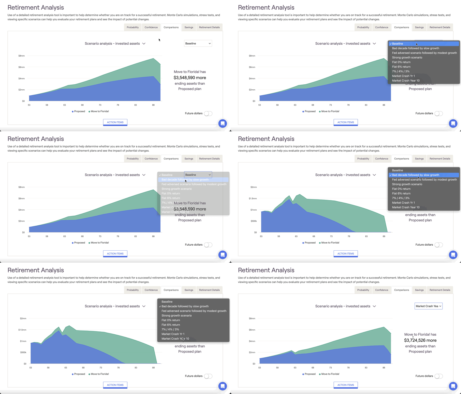
To inject some volatility into the Comparions tab, you can implement custom return scenarios to recalculate the values shown using a different sequence of returns. Use the dropdown box on the right to toggle between return scenarios:

There are four pre-built return scenarios:
Bad decade followed by slow growth
Fed adverse scenario followed by modest growth
Strong growth scenario
Flat 0% return